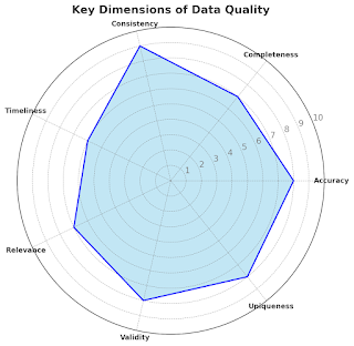
Alert visualization recipe: Get out your blender, drop in some sp_send_dbmail, Google Charts API, add your favorite colors and sprinkle with html. Blend till it’s smooth and looks pretty enough to taste.
I really like database monitoring. My email inbox have a constant flow of different types of alerts coming from our production servers with all kinds of information, sometimes more useful and sometimes less useful. Usually database alerts look really simple, it’s usually a plain text email saying “Prod1 Database data file on Server X is 80% used. You’d better grow it manually before some query triggers the AutoGrowth process”.
Imagine you could have received email like the one below. In addition to the alert description it could have also included the the database file growth chart over the past 6 months. Wouldn’t it give you much more information whether the data growth is natural or extreme? That’s truly what data visualization is for.
Believe it or not, I have sent the graph below from SQL Server stored procedure without buying any additional data monitoring/visualization tool.
Would you like to visualize your database alerts like I do? Then like myself, you’d love the Google Charts.
All you need to know is a little HTML and have a mail profile configured on your SQL Server instance regardless of the SQL Server version.
First of all, I hope you know that the sp_send_dbmail procedure has a great parameter @body_format = ‘HTML’, which allows us to send rich and colorful messages instead of boring black and white ones. All that we need is to dynamically create HTML code.
If you want to add more visualization effects, you can use Google Charts Tools https://google-developers.appspot.com/chart/interactive/docs/index which is a free and rich library of data visualization charts, they’re also easy to populate and embed.
There are two versions of the Google Charts
1. Image based charts: https://google-developers.appspot.com/chart/image/docs/gallery/chart_gall
This is an old version, it’s officially deprecated although it will be up for a next few years or so. I really enjoy using this one because it can be viewed within the email body. For mobile devices you need to change the “Load remote images” property in your email application configuration.
2. Charts based on JavaScript classes: https://google-developers.appspot.com/chart/interactive/docs/gallery
This API is newer, with rich and highly interactive charts, and it’s much more easier to understand and configure. The only downside of it is that they cannot be viewed within the email body. Outlook, Gmail and many other email clients, as part of their security policy, do not run any JavaScript that’s placed within the email body. However, you can still enjoy this API by sending the report as an email attachment.
Here is an example of the old version of Google Charts API, sending the same top databases report as in the previous example but instead of a simple table, this script is using a pie chart right from the T-SQL code
If you need more information on how to customize the charts, you can try the following:
- Image Based Charts wizard https://google-developers.appspot.com/chart/image/docs/chart_wizard
- Live Image Charts Playground https://google-developers.appspot.com/chart/image/docs/chart_playground
- Image Based Charts Parameters List https://google-developers.appspot.com/chart/image/docs/chart_params
- Java Script Charts Playground https://code.google.com/apis/ajax/playground/?type=visualization
Use the above examples as a starting point for your procedures and I’d be more than happy to hear of your implementations of the above techniques.
Yours,
Maria


Comments
Post a Comment